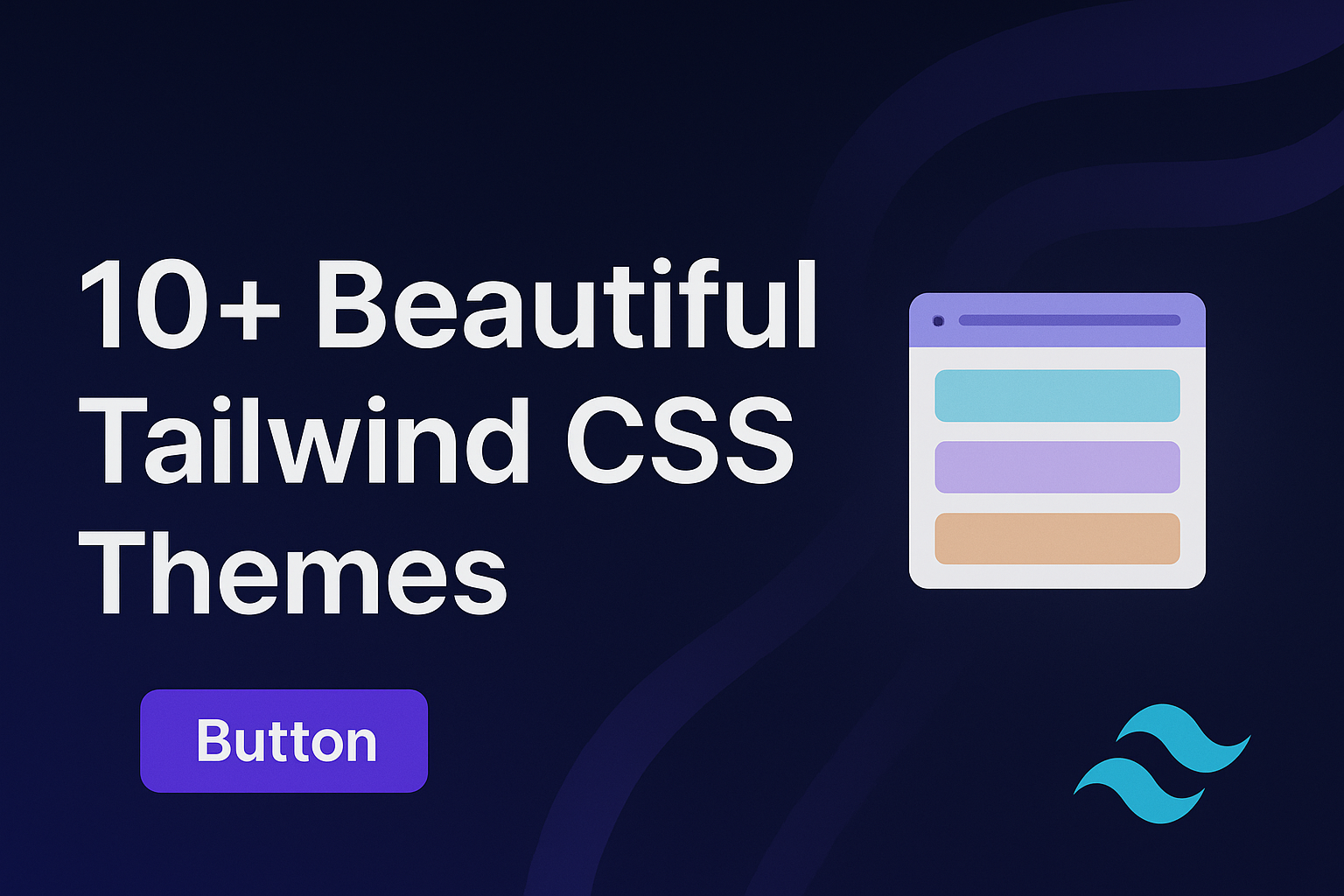
Tailwind CSS Themes: Customize Your Design with NiraUI
A Tailwind CSS theme defines your project’s overall style — including colors, typography, spacing, and design tokens. Instead of writing custom CSS for every page, you can centralize your entire design system inside your in css file.
This not only keeps your codebase clean but also makes it easy to manage brand consistency across large projects.
How to Configure a Tailwind CSS Theme
You can define and extend your theme directly in your tailwind.config.js file.
// tailwind.config.js
module.exports = {
 theme: {
   extend: {
     colors: {
       primary: '#2fc6f8',
       secondary: '#a835fa',
       success: '#02ce57',
       danger: '#f51d2f',
       warning: '#fabf2b',
      },
    },
  },
}
Enabling NiraUI’s Built-In Themes
NiraUI includes several predesigned themes you can apply instantly.
To activate one, just add the data-theme attribute to your HTML element.
<html data-theme="midnight"></html>
That’s it — the Midnight theme now applies globally to your entire page.
You can switch between themes anytime by changing the value of data-theme.
Create Your Own Tailwind CSS Theme
NiraUI themes are fully customizable.
To create your own theme, define your custom variables and apply them with a data-theme name:
[data-theme="mytheme"] {
--color-primary: oklch(72.895% 0.13049 86.648);
--color-secondary: #2E004F;
--color-accent: #E8C66A;
--color-success: #3AA76D;
--color-danger: #B3261E;
--color-warning: #F6C851;
--color-base-content: oklch(21% 0.13049 86.648);
--color-base-content-100: oklch(30% 0.13049 86.648);
--color-base-content-200: oklch(39% 0.13049 86.648);
--color-base-content-300: oklch(48% 0.13049 86.648);
--color-base-100: oklch(100% 0.13049 86.648);
--color-base-200: oklch(95% 0.13049 86.648);
--color-base-300: oklch(83% 0.13049 86.648);
--color-base-400: oklch(80% 0.13049 86.648);
}
Then apply it globally:
<html data-theme="mytheme"></html>
Or apply it to a specific NiraUI Components
My Theme
Calm, focused, and easy on the eyes. Great for dashboards and coding tools.
My Theme
Calm, focused, and easy on the eyes. Great for dashboards and coding tools.
Built-In NiraUI Themes
NiraUI ships with multiple ready-to-use themes. Try them out:
Light
Dark
Midnight
Steel
Storm
Sunset
Rose
Gold
Corporate
Retro
Lofi
Pastel
Dracula
NiraUI Tailwind CSS Components
Buttons
Cards
Badges
Form Elements
Input fields and interactive controls
Avatars
User profile images


Alerts
Notification messages
Alert Message Headline
Alert Message Headline
Alert Message Headline
View all NiraUI Components
🚀 Try NiraUI Themes in Your Project
Step 1: Install NiraUI:
npm i nira-uiAdd it as a Tailwind CSS plugin
@import "tailwindcss";
@plugin "nira-ui/plugin.js";
Step 3: Set your theme in HTML:
<html data-theme="sunset"></html>Your entire project will now instantly adapt to your selected theme.
No extra CSS, no configuration headaches just plug, play, and design beautifully.
With NiraUI, you can explore new color systems, quickly theme entire dashboards, and deliver professional-looking UIs without sacrificing performance or control.