All NiraUI TailwindCSS Components
NiraUI offers a collection of prebuilt 20+ components designed to accelerate your project development.
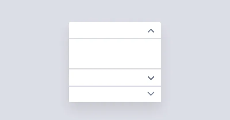
Accordion
Accordion is used for showing and hiding content but only one item can stay open at a time.

Alert
Alert informs users about important events.
Avatar
Avatars are used to show a thumbnail representation of an individual or business in the interface.
Badge
Badges are used to inform the user of the status of specific data.
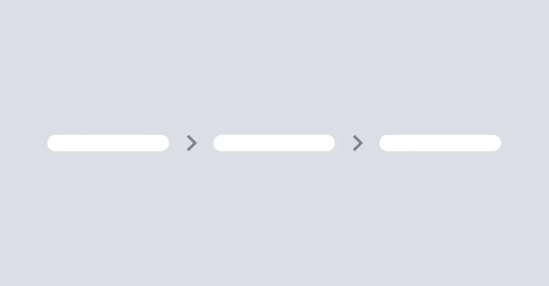
Breadcrumbs
Breadcrumbs helps users to navigate through the website.
Button
Buttons allow the user to take actions or make choices.
Button Group
Button Group component is used to trigger actions.
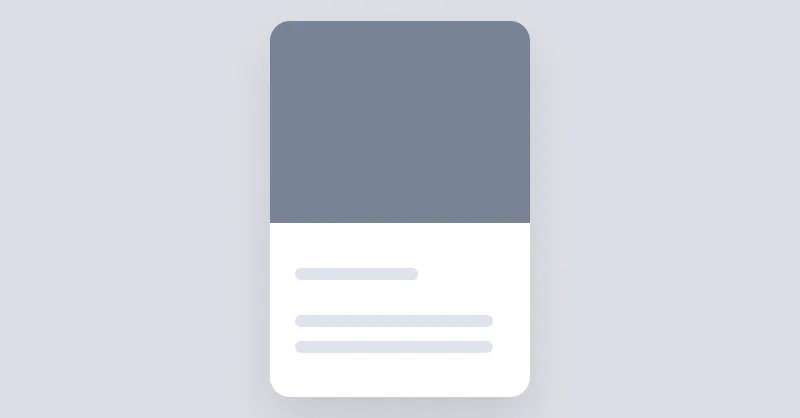
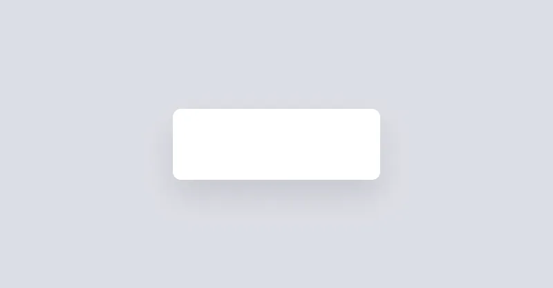
Card
Cards are used to group and display content in a way that is easily readable.

Checkbox
Checkboxes are used to select or deselect a value.
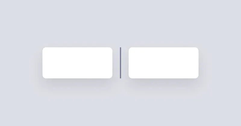
Divider
Divider will be used to separate content vertically or horizontally.
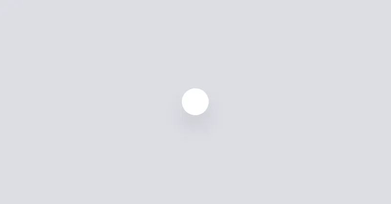
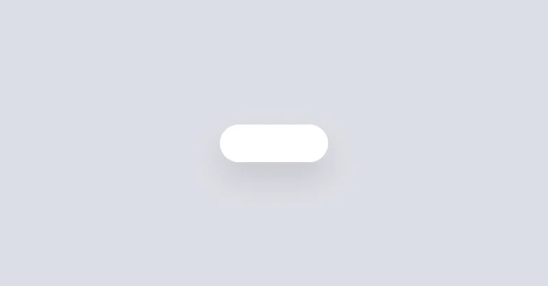
Dot
Dot is a really small icon to visually show the current status of an element, like online, offline, error, etc.

Drawer
Drawer is a grid layout that can show/hide a sidebar on the left or right side of the page.
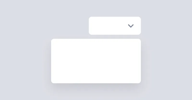
Dropdown
Dropdown can open a menu or any other element when the button is clicked.

Footer
Footer can contain logo, copyright notice, and links to other pages.
Form
Forms classes that can be used to create different types of forms.
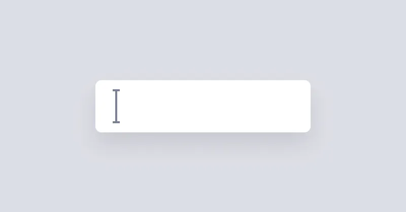
Input
Input is a simple input field.
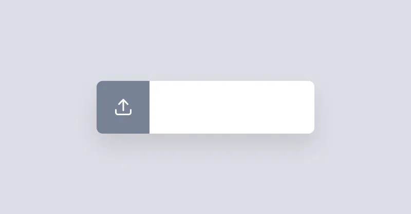
Input File
Input File is a an input field for uploading files.
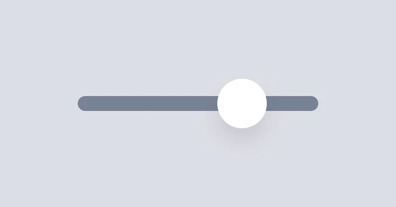
Input Range
Input Range is used to select a value by sliding a handle.
Kbd
Kbd is used to display keyboard shortcuts.

Link
Link adds the missing underline style to links.
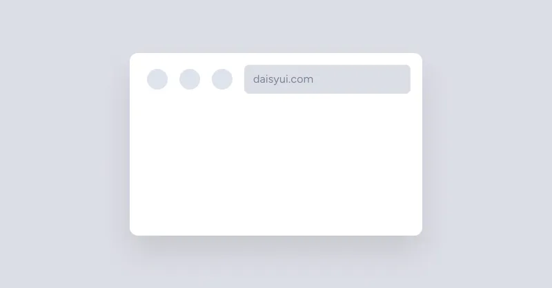
Mockup Browser
Mockup Browser shows a box that looks like a browser window.
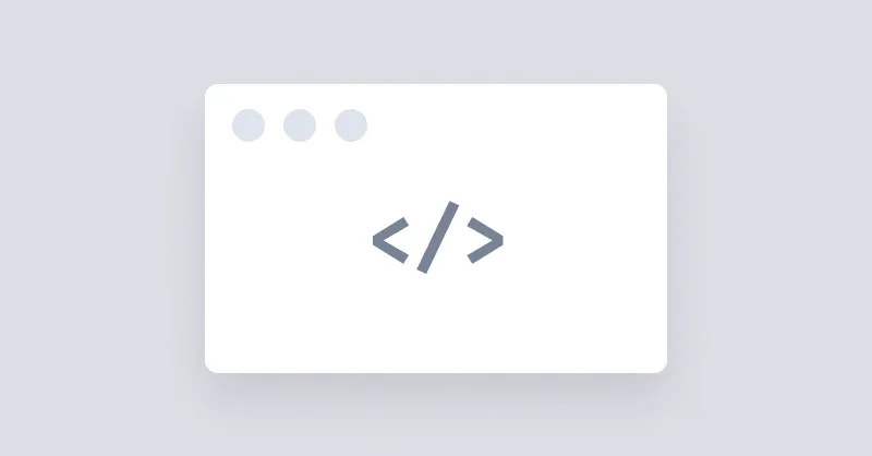
Mockup Code
Mockup Code is used to show a block of code in a box that looks like a code editor.
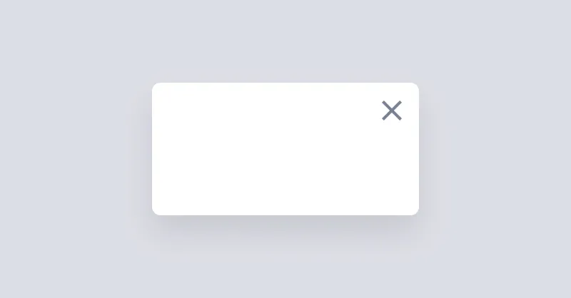
Modal
Modal is used to show a dialog or a box when you click a button.

Navbar
Navbar is used to show a navigation bar on the top of the page.
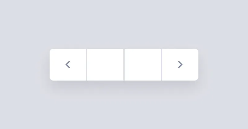
Pagination
Pagination is a group of buttons that allow the user to navigate between a set of related content.
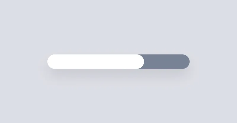
Progress
Progress bar can be used to show the progress of a task or to show the passing of time.

Radio
Radio buttons allow the user to select one option from a set.
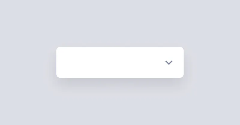
Select
Select is used to pick a value from a list of options.
Sidebar
Sidebar is used to display supplementary information or navigation options.
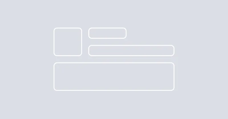
Skeleton
Skeleton is a component that can be used to show a loading state of a component.

Spinner
Spinner can be used to show the progress of a task or to show the passing of time.
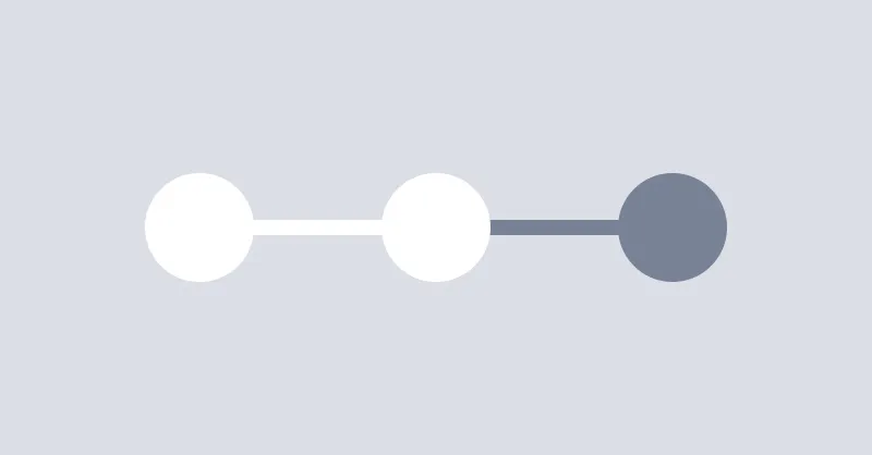
Steps
Steps can be used to show a list of steps in a process.
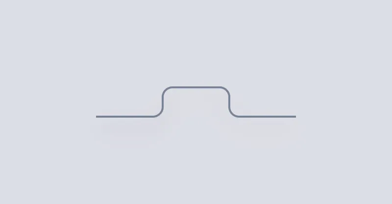
Tabs
Tabs can be used to show a list of links in a tabbed format.
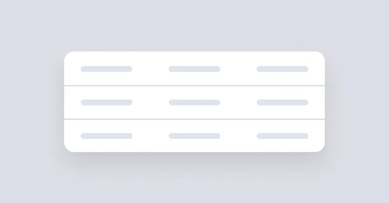
Table
Table can be used to show a list of data in a table format.
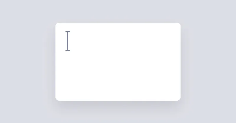
Textarea
Textarea allows users to enter text in multiple lines.
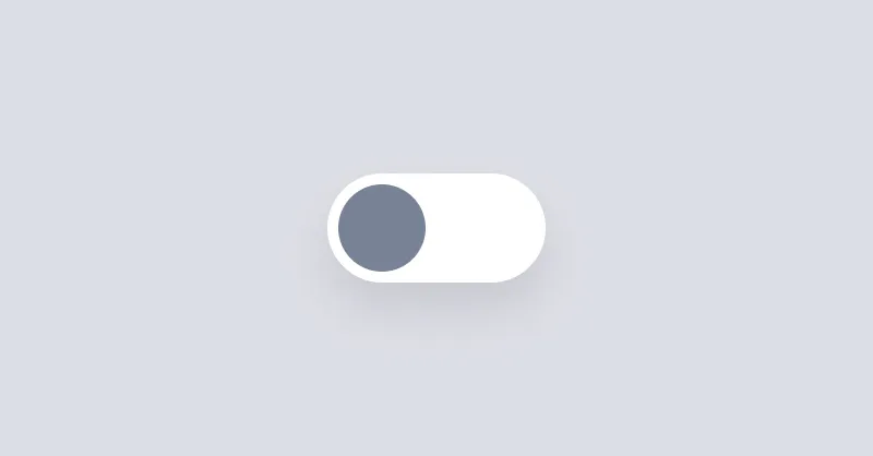
Toggle
Toggle is a checkbox that is styled to look like a switch button.

Tooltip
Tooltip can be used to show a message when hovering over an element.