
Free Tailwind CSS UI Components Library
NiraUI is a modern Tailwind CSS plugin built for African developers especially those who want to design clean, responsive interfaces in minutes without touching JavaScript.
What is NiraUI ?
NiraUI is a lightweight Tailwind CSS component library that helps you write cleaner, shorter, and more expressive code.
Forget those long utility chains just use simple, human-friendly classes like button, card, or alert to build your UI faster than ever.
Why Nigerian Developers ❤️ NiraUI?
Fast Setup
Just install and go. No extra config, no JavaScript headaches, no dependency wahala.
Customizable
Every single thing is yours to tweak built entirely with Tailwind utilities, so it fits your design system.
Take Tailwind to the Next Level
Simplify your workflow and make your code more readable. With NiraUI, you can go from this ⬇️
❌ Just TailwindCSS
To this 😎
✅ After with NiraUI
Less typing. More building.
10+ Beautiful Themes
From Light to Midnight, Retro, Sunset, Lofi, and more — NiraUI gives you modern, aesthetic themes ready to use out of the box. Perfect for personal portfolios, SaaS dashboards, or client projects.
🌞 Light
NiraUI is amazing
🌚 Dark
NiraUI is amazing
🎵 Lofi
NiraUI is amazing
🎮 Retro
NiraUI is amazing
🌅 Sunset
NiraUI is amazing
🌌 Midnight
NiraUI is amazing
Highly Customizable
Change your design vibe anytime. From soft, pastel palettes to bold gradients all it takes is a few Tailwind utilities.
Button Component
No More Ugly HTML
Write fewer class names. Use component class names and modify them with Tailwind CSS utilities.
❌ Just TailwindCSS
✅ After TailwindCSS + NiraUI
Pure CSS. 💪 Works Everywhere
NiraUI is pure CSS and framework-agnostic. Use it with React, Vue, Svelte, Next.js, Laravel, Astro, Angular, or anything else no setup drama.
Install NiraUI
Install NiraUI in Your Tailwind Projectnpm i nira-ui@import "tailwindcss";
@plugin "nira-ui/plugin.js";


NiraUI Components
NiraUI includes a growing collection of accessible, production-ready components:
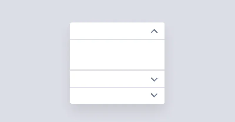
Accordion
Accordion is used for showing and hiding content but only one item can stay open at a time.

Alert
Alert informs users about important events.
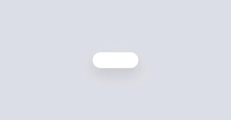
Avatar
Avatars are used to show a thumbnail representation of an individual or business in the interface.
Badge
Badges are used to inform the user of the status of specific data.
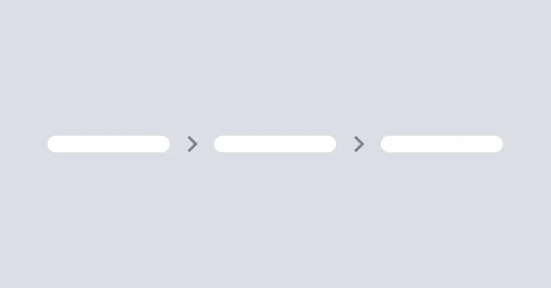
Breadcrumbs
Breadcrumbs helps users to navigate through the website.
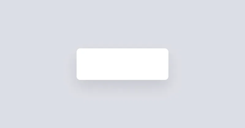
Button
Buttons allow the user to take actions or make choices.
Button Group
Button Group component is used to trigger actions.

Card
Cards are used to group and display content in a way that is easily readable.

Checkbox
Checkboxes are used to select or deselect a value.
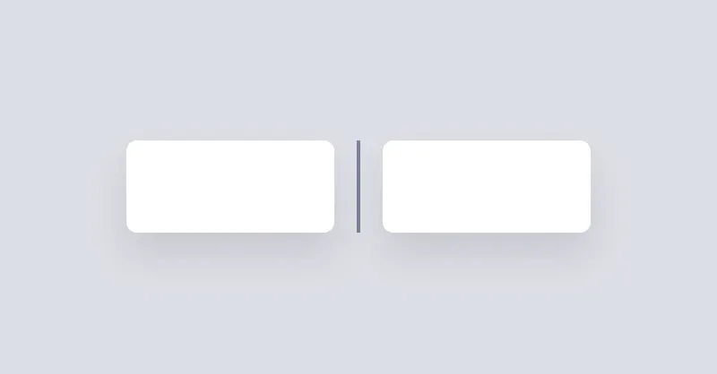
Divider
Divider will be used to separate content vertically or horizontally.
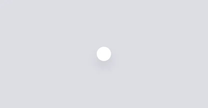
Dot
Dot is a really small icon to visually show the current status of an element, like online, offline, error, etc.

Drawer
Drawer is a grid layout that can show/hide a sidebar on the left or right side of the page.
NiraUI Icons
NiraUI Icons is an open-source collection of beautiful, consistent, and responsive icons built for Tailwind CSS. Search, copy, and customize icons with tailwind css for your next project.
Install NiraUI in 3 Steps
Add NiraUI to your Tailwind project in just a few simple steps.
1. Install the package
npm i nira-ui2. Import Tailwind & NiraUI in global.css
@import "tailwindcss";
@plugin "nira-ui/plugin.js";3. Start using components
Support NiraUI 💚
NiraUI is crafted with passion by Rume Aluya to make Tailwind development faster and simpler. Your support helps me build new components, improve documentation, and grow the open-source ecosystem.
💚 Become a sponsor